This whole quest started as I realized that color balance is often wrong with the HDR-FX7 when shooting outdoors under the bright sun: sometimes the color green has a strange look with Auto White Balance, a slight-to-severe warm yellow cast under the sunlight.
So I investigated the color settings that are available within custom Picture Profiles, with the purpose of fixing the color green – or as some might say, making green closer to consumerish tastes.
I took the following approach:
- Make practical tests with the color settings,
- Make a theory of how the color settings would roughly equate to geometrical transformations in the color space,
- Use the geometrical approach to determine methods that would make greens greener,
- Simulate the settings with NLE color corrections,
- Come up with a proposed recommendation which is based on combined WB Shift and Color Level, so as to build a custom Picture Profile.
Practical tests
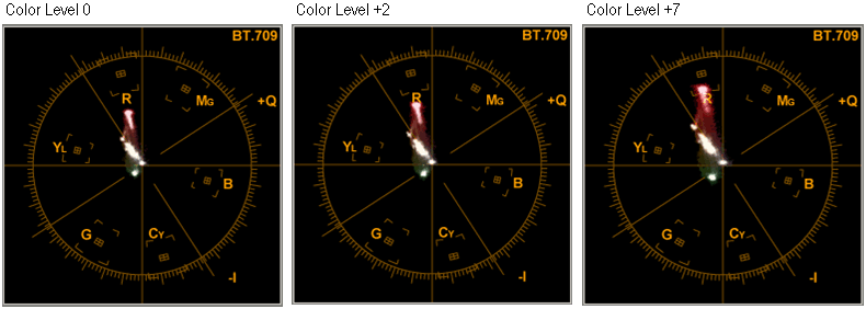
I shot the same target (green and red folders / binders on a white wall cast with strong incandescent yellowish light), adjusting various color settings on the FX7. Pay close attention to how the green dot moves on the vectorscope…
Fig.1: screenshots of the vectorscope for White Balance Shift = -7/0/+7, Color Phase = -7/0/+7, Color Level = +2.
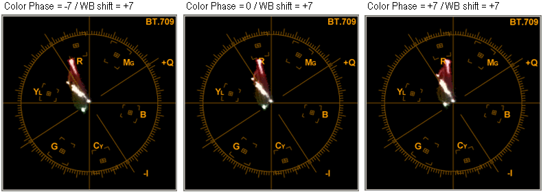
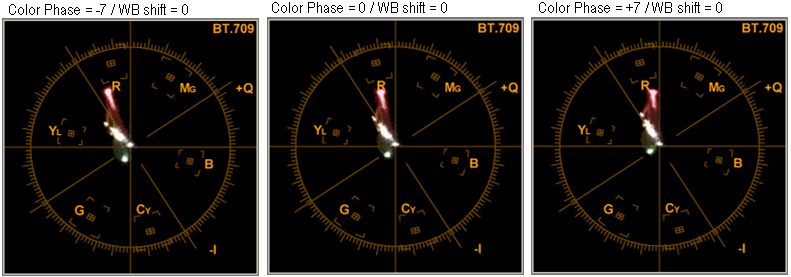
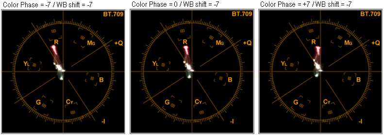
Fig.2: screenshots of the vectorscope for Color Level = 0/+2/+7, WB Shift and Color Phase = 0.
Interpretation of color settings
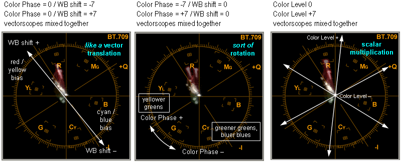
Then I put together, on the same picture using 50% transparency, the vectorscope screenshots for the extreme values of each setting. The purpose is to show how the image moves on the vectorscope as you change the values for each color setting. This way it appears that:
- WB Shift behaves roughly like some vector translation, i.e. the whole vectorscope shifts,
- Color Phase (hue) behaves like some rotation, i.e. the whole vectorcope rotates,
- Color Level (saturation) behaves like a scalar multiplication, i.e. the whole vectorscope expands or contracts.
Fig.3: geometrical interpretation of color settings.
Proposed methods to improve greens
Using the geometrical approach, I therefore determine that I want to try & make greens greener with 2 different methods:
- WB Shift the whole image away from yellow, then use Color Level to put the reds and saturated yellows right back where they were in the first place, so that only the greens and blues steer away from yellow.
- Or rotate the image towards the greens (Color Phase) while WB Shifting the whole image away from yellow beforehand, to avoid getting greenish yellows.
Simulations through color correction
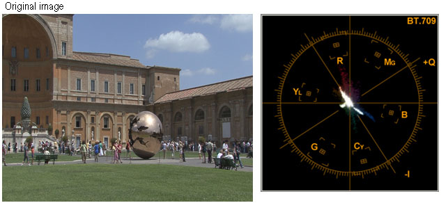
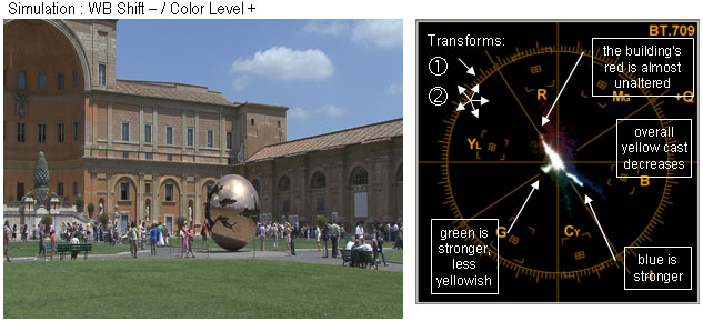
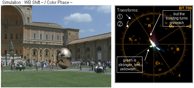
Here are the simulations that I did with the color correction tools in EDIUS (White Balance and Color Wheel):
- WB Shift combined with Color Level give the best results: greener green, bluer sky, less yellow cast on the whole image while keeping the red building about right.
- WB Shift combined with Color Phase produce the greenest grass (so the geometrical approach did meet its objective), but at the expense of making the building unpleasantly greenish.
Note – you need a carefully calibrated monitor to see the differences in colors.
Fig.4: simulations.
Conclusion and proposed custom Picture Profile
Therefore, to achieve better greens with the FX7 and less yellow cast, I would recommend to decrease White Balance Shift and increase Color Level.
By how much do we want to do that, are WB Shift -1 and Color Level +1 enough? Next part will address this question through practical tests.